Wednesday 2 November 2011

Star Image Analysis


I am analysing how Arctic Monkeys star image has developed over time through their music videos. Arctic Monkeys are a band formed in Sheffield consisting of Alex Turner, Jamie Cook, Nick O’Mally and Matt Holders. Their first and second albums are indie rock while the third and fourth are more lad rock and have a darker feel to them.

All the videos from their first and second albums are mainly narrative but there’s two which are performance based. In their narrative based videos none of the band members are in the videos and the performance based videos are very casual. Fake Tails of San Francisco, which is their first video, is filmed in bars and venues where they played when they were first becoming known. Their music video Teddy Picker was filmed as though they were recording the song, it also shows scenes where they’re in a pub creating a casual vibe to the overall video. It seems as though the video isn’t staged. Their videos from the third and fourth albums are more performing than narrative based and even their two narrative based videos feature Matt Holders following a similar story in both videos which allows them to become remembered by their faces. Majority of their new music videos are performing for example Don't Sit Down 'Cause I've moved your Chair and Crying Lighting. All the videos from the last two albums have are staged.

The style in which they portray themselves in front of the camera has varied album from album. In two of their older videos, Fake Tales of San Francisco and Teddy Picket, arctic monkeys are seen as scruffy young adults with no sense of style. These videos both contain close-ups of the band. From their third album, the video for Crying Lighting shows them with more of a smarter vintage feel. Suck it and See is off their fourth and latest album, this video is narrative based and Matt Holders plays a typical bad boy adding to the darker rock vibe of this whole album. 

Their videos from the last two albums all have effects except one, Cornerstone which is a very simple video. Their older videos don’t have effect and are kept to mostly natural tones. Don’t Sit Down 'Cause I've Moved Your Chair is multi-coloured and has a blurred effect so all you can see are silhouettes of them and their instruments. Suck it and See has a vintage effect on the camera and so does Evil Twin. The video for Evil Twin seems as though it’s a follow on from the video for Suck it and See which is why they've kept the same effect. Finally, the video for My Propeller is in black and grey and you only see their silhouettes like in their other video. All these videos are performing based videos which show them rocking out on their instruments which adds to the rock vibe.

The main ways in which Arctic Monkeys as a band have developed is though how they're shown in their videos for instance, majority of their old videos were narrative based while now majority of their videos are performance based. They've grown in style both musically and in the way they present themselves.

Tuesday 11 October 2011

Textual Analysis of a Music Video

I am analysing Nirvana’s video for the single ‘In Bloom’. The video was released in 1992 and was directed by Kevin Kerslake. The genre of this band is Alternative indie rock/Grunge and the video characteristics for them genres is generally playing instruments and acting like they don’t care. This video is performance based but the performance is based into the narrative as they’re performing on a show. It has an early 1960’s feel as it’s filmed on an old camera and is continuously in black and white. 


There is a relationship between the lyrics and the video made for this song. The title of the song ‘In Bloom’ is also featured in the song lyrics. This phrase could suggest that they’re the prettiest and most presentable they’ve ever been and will be to the general public. This song is about the fame they’ve received after their breakthrough single ‘Smells like teen spirit’ in 1991 and how people like them because other people do, yet they don’t understand what their music is really about. This is where the lyric ‘He’s the one who likes all our pretty songs’ comes from. Additionally, Nirvana are shown described as ‘thoroughly all right and decent fells’ which is completely different to how they actually are shown.

This video is split into two parts. The majority of the video is the band being shown dressed in suits and playing their instruments normally while the second is them dressed in dresses, tearing apart the stage causing havoc. The second part of the video, they’re shown as how they are majority of the time to the public. This video shows them acting differently to how they normally would, which could suggest they’re putting on a front while dressing in suits when they actually feel like being reckless and tearing the stage apart. Since this video is set in the 1960’s it could be referring to how even though their songs are just becoming popular and they’re just being noticed on the radio they’ve been around for a long time, obviously not as long as the 1960’s but I feel that’s what they’re trying to show.

This video is like their other videos in the sense that all of their videos have a performance based plot with a narrative as well. The video for ‘In Bloom’ has been shot with a 1960’s feel and in black and white, which none of their other videos have. Their video for the song ‘Smells like teen spirit’ also has a crowd but in that video, the crowd seem livelier because they jump up from their seats while in this video they just cheer throughout the video. There is close ups of the leader of the band, Kurt Cobain which is how the label can sell the track because people remember faces rather than names.

Overall this video is mainly a typical music video for the genre of this band with a few differences like them dressing smart and having a 1960's feel to it. It's similar to their other music videos as well, as they all have a performance base.

Wednesday 21 September 2011

Evaluative Analysis


The typical poster conventions I have used in my poster are the rating, this will make teenagers who are around the age of fifteen want to see this movie because it’s commonly known that teenagers like to see how their generation is displayed in the media. Another poster convention I have used is making the title of the movie bigger than the rest of the font; this makes the name stand out so hopefully people will remember it. My poster has the information about the movie on the front and the release date. The representations in my poster show that the title and the picture I have used link.

I think my storyboard of my trailer for my movie idea is good because it uses the trailer conventions, I used the correct time line and I believe I have successfully portrayed the genre of the movie in the trailer. My storyboard of my trailer has the title of the movie in the beginning of the trailer and at first the movie is presented as light and it seems as though it doesn’t have a deep story line, but as the trailer goes on you find out that the film has a dark tale. My trailer follows the life of two teenage girls and as the target audience is teenagers above the age of 15, I think my advert displays that perfectly. Teenagers are interested in watching movies displaying how they are portrayed in society today. I chose paramount pictures to produce and distribute my film because I know they have produced other teenager movies like Clueless.

Mock Up of Final Poster

Storyboard Analysis

I think my storyboard of my trailer for my movie idea is good because it uses the trailer conventions, I used the correct time line and I believe I have successfully portrayed the genre of the movie in the trailer. My storyboard of my trailer has the title of the movie in the beginning of the trailer and at first the movie is presented as light and it seems as though it doesn’t have a deep story line, but as the trailer goes on you find out that the film has a dark tale. My trailer follows the life of two teenage girls and as the target audience is teenagers above the age of 15, I think my advert displays that perfectly. Teenagers are interested in watching movies displaying how they are portrayed in society today. I chose paramount pictures to produce and distribute my film because I know they have produced other teenager movies like Clueless.

Thursday 19 May 2011

Fight Club Trailer Analysis

A trailer includes important moments from the movie and they don't have to be organised in the same order as the film. They can't give anyway the most important plot details of the movie as that would ruin the film plot. Majority of the time the title of the movie is shown after the trailer with the release date and the names of the main actors/actresses are usually put at the beginning. A lot of movie trailers include the names of the director and a powerful voice-over to catch the eye of the audience. Also, music seems to be essential in trailers ­because it can suggest the genre of the movie, the style and the plot of the film.

The target audience of the trailer would be adults who like drama/sci-fi and who can follow a confusing plot as it does have a confusing plot. The unique selling points of this movie are that it's different, you can tell from the trailer it's not the usual plot and it brings something different to the film industry. The main stars are in most of the scenes in the trailer. By watching the trailer, you understand that the plot is about the main character having insomnia and then meets Tyler Durden on a plane and starts a fight club with him. This is where the main plot begins and you can see the movie includes lots of violence and is very aggressive. The trailer doesn’t include any information about the release date.

The narrator’s voice-over is used in the trailer, and he’s saying random lines in the movie which basically describe the plot without giving away the ending. You get a much better idea of what the plot is from the trailer than the poster. I find this because the trailer gives more of the plot away with what the main characters are saying and the scenes you see you get to understand that this movie has a complex story line which intrigues the viewers quite a lot.
 
In this clip of the trailer, you can see a fight scene which tells the audience the movie is violent and the title does have a link to the movie. A lot of the scenes used in the trailer are very dark which could show that the movie has a dark story line, also this could add to the genre which is drama. Also, the main music used in this trailer is a song called ‘Where is my mind?’ by Pixies. The title of the song, which is also the repeated many times during the song, gives off the characters minds are messed up.


Tuesday 17 May 2011

Fight Club Poster Analysis

Typical codes and conventions of film posters are the names of actors/actresses, eye catching images, critic review, production blurb, a tagline and a large title of the film. This film poster has a tagline, a large title of the film, an eye catching image and the name of the main actors.

All audiences expect to see these aspects on a film poster. The genre of Fight Club is Drama/Thriller. From the film poster I can tell the genre of the film is a drama/thriller because one of the supposed main characters (Tyler Durden) on the cover looks aggressive, angry and ready for a fight. He looks aggressive because of his clenched fist and tightened jaw.  The other character is also the narrator of the movie (he is unnamed but is played by Edward Norton) looks very mischievous like he has a sick, mastermind plan. In this poster, Tyler Durden is holding the bar of soap (which the title of the movie is engraved into) very tightly and aggressively. You get the vibe that the movie is a very violent movie based on fighting hence the title.
The title has been designed this way because it shows the character/characters are very skilled with soap and know how to create things from it. It also shows that soap will be featured in the story line somewhere. Like I said before, Tyler Durden (who is played by Brad Pitt) is clenching the bar of soap aggressively. Since the bar of soap is bright pink it stands out from the rest of the movie poster which is dark tones of the colours green and black. This makes the title an eye catching image. The poster also includes the tagline, ‘Mischief. Mayhem. Soap.’ This tells the audience viewing this poster, that the movie would be about causing chaos using soap as the substance.
This movie is based on a book by Chuck Palahniuk, even though the movie poster doesn’t say this. I think the people who would be interested in seeing this film would be people of an older age group, seeing as the movie is an 18 and it has an interesting but complex and confusing story line. The main selling points of this movie would be the well known actors, and the fact that the movie is based on a book. So the people who liked the book will see the movie.  Also, on the poster it says ‘A David Flincher film’. This is a very good selling point because David Flincher is a very experienced and well known director. He’s worked with a lot of famous movies so if people have liked his other movies, they would want to see this one.
I like this movie poster because of the contrast between the colours. The name of the movie really stands out and obviously gives something away about the film. I like both the character’s expressions and the way the poster is set up. If I saw this poster on a bus or billboard, I would be intrigued to see it.  

Wednesday 30 March 2011

Assignment Bank 1: Advertising & Marketing; Advert and Explanation


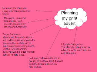
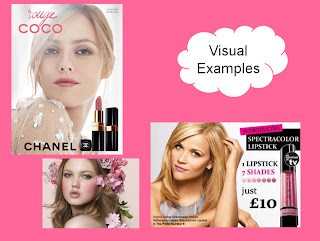
My advert is a lipstick advert for Chanel. The persuasive techniques I used in my advert are using a beautiful person and  personal appeal. My advert is aimed at those in A and B social catogories and Trendies or Egoists in lifestyle catogories. The ideologies that are associated with this advert are classy but girly at the same time. My advert appeals to the target audience because the model is a young famous actress which would appeal to young and middle aged women. It also appeals as my ideal target audience as I have used a beautiful person to represent my product making people believe they would look as the model does and therefor buy the product. The needs I have associated with my advert are self-esteem, confidence, creativity, spontaneity and respect by others. The persuasive techniques I have used in my advert are using a famous actress. I used indirect because the advert is for Chanel and as Chanel is a very well known for it's products so I didn't think I had to use it.

(On the computer I made this advert on, the background is much darker. You can't see the dots on the lipstick and the lipstick on my model's face is a deeper pink.)

Assesment Bank 1: Final Advert Draft

Assignment Bank 1: Advertising & Marketing; Images Taken For My Advert

Tuesday 1 February 2011

Assignment Bank 1: Advertising & Marketing; Questionnaire Results

 This question tells us 50% of the people who took my questionnaire spend an average amount of £7.00 to £10.00. This gives me an idea that my lipstick should be priced around this amount.
 
The results of this question tells us all the people who took my quiz my quiz all used their brand because of its good quality. More than half of the people in my group also use the brand because it's been recommended and just over half buy their products because of good advertising. This shows that making a good quality product that has a good reputation is effective.  

The results of this question tells us all the people who voted on my quiz wear make up, and so I know that my product would be good majority if not all girls.

Monday 3 January 2011

Assignment Bank 1: Advertising & Marketing; Advert Analysis

This is a print advert of Britney Spears' perfume 'Fantasy'. The expression on Britney’s face shows us that the advert is direct seeing as she is looking straight into the camera. She has a dazed and mysterious look on her face which could tell the viewer that the fragrance makes you feel mysterious. Britney Spears is advertising this product because it's her fragrance. When people see Britney advertising this they would immediately think of her sweet and innocent reputation when she was a teenager. In this advert, Britney Spears' is standing to the side with her head turned to face the camera and with her hand up beside her face as though she's shy and has something to hide. Her hair is being blown off her face which makes the advert seem powerful. She looks like she doesn't really know her whereabouts but doesn't seem to care, as if all that matters is the way she's feeling or smelling because of this perfume, as if it overpowers everything. Britney Spears is wearing a dress which some parts of matches the colour of the background, this could show that she blends in with the back ground, which is all pink flowers and a part of a tree. By doing this they could make a resemblance to the nature feeling background and the perfume by making the perfume smell natural and sweet like flowers. The product is not as big as is fairly big. The colour scheme used in this writing is artificial. It has a white glow around it which could represent that it's a powerful scent and could make you glow as Britney also has a while glow around her hair and on her face. The target audience of this product would be either teenagers or young adults because the fragrance is a very girly and because Britney Spears is a young girly adult.


This is a print advert of Scarlett Johansson for Dolce & Gabbana. It's advertising a red lipstick. Scarlett Johansson’s facial expression in this image shows her slightly off guard. She is also mid-gazing at something with a look of lust on her face, which could seem that she wants the product really bad. I imagine Scarlett Johansson has been chosen to model this product because she's known for wearing red lipstick a lot in her real life. As well as that, many people look up to her and think she's extremely sexy and beautiful.  In this image, Scarlett is laying down in a venerable position.  The tip of her index finger is gently touching her mouth, which is open. This connects to her facial expression that she has a look of lust on her face and by her finger touching her lip it expresses that more. Scarlett is wearing a cream corset showing a lot of her skin, she's lying on a leopard print blanket and her hair is a shade of blonde. This makes a contrast with the product because everything is a cream or brown colour, except her nails and most importantly her lips. This is used to create an effect for the lipstick to stand out against all the brown and cream tones, which makes the viewer, know the lipstick is being sold. The product on the page is fairly small but it's larger than the name of the brand. It's in the left hand corner while Scarlett takes over most of the page, which shows that seeing how she feels while wearing the product is more important than the product. The target audience of this product would be people who are classy and like to stand out.

The main difference of how the models are represented in the adverts is the first is more girly and enchanted while the second is more sexual. The target audience is similar for both the adverts as they're both directed at females although I feel as though the first advert is more directed to younger adults while the second is directed to older women. The main persuasive technique used in both of the adverts is the use beautiful people, this makes people want to buy the products because they belive is they do they'll look like the model. The second advert also mainly uses sex sells as a persuasive technique, this would persuade people to wear the product who are looking for a response from who they're attracted to.